
In the process of creating UI/UX designs, one of thinks that the pure aesthetic of the design is all there is. But thinking about the usability and accessibility of the design is just as important, and in this case, so important that it could save lives.
As part of the course EXTA65 Kognition I redesigned the UI for the Rädda Hjärtat app developed by Hjärt-Lungfonden. By applying Don Norman’s principles of design, I reimagined the app to be more effective in high-stress situations.
The app is primarily used on the one hand as a tool to spread knowledge about CPR in the event of sudden cardiac arrest, and on the other to find the nearest defibrillator in such situations.
The app in its current state
During a cardiac emergency, the chance of survival decreases by 10 percent for every minute that passes without any help. The original app provided CPR instructions and defibrillator locations, but its interface posed challenges:
- Inconsistent signifiers for the same action, together with many unneccessary signifiers
- Users have to navigate multiple screens before finding critical information
- Cognitive overload from too much text and cluttered visuals slowed down reaction times
- Defibrillator opening times are not visible on the map
- Unclear how to navigate to a defibrillator
Applying Norman’s Principles to the Redesign
Affordances & Signifiers: Making actions clearer
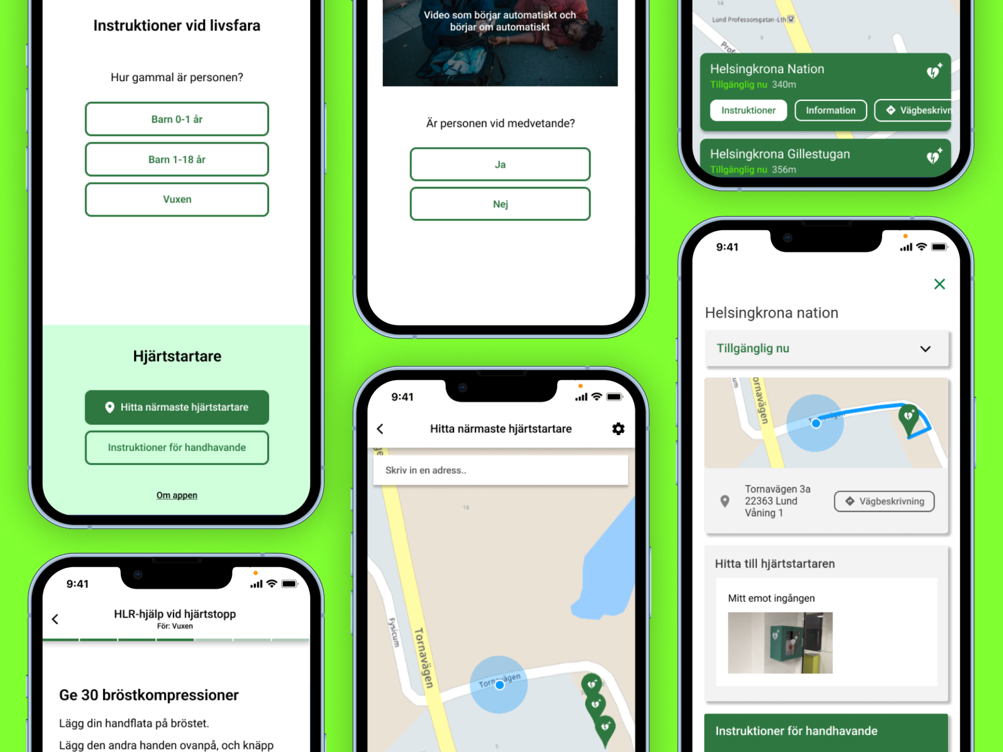
I redesigned the app’s main screen to feature large, high-contrast buttons that clearly indicate their purpose. The app’s two main purposes are clearly highlighted as two different parts of the screen. Instead of vague icons, I used direct labels like “Call 911” and “Find Defibrillator.” These explicit signifiers remove hesitation, ensuring that users immediately know what to do.
Reducing the risk of errors
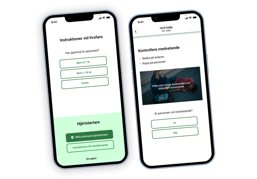
A user under stress doesn’t have time to search for instructions. Instead of long texts that give the user detailed instructions that depend on different outlined scenarios, I switched the format to a questionnaire. Now, each instructions is tailored to the user based on the answered questions.
Conceptual Model: Making the App Feel Instinctive
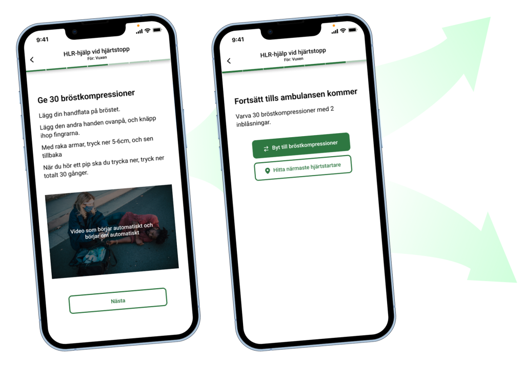
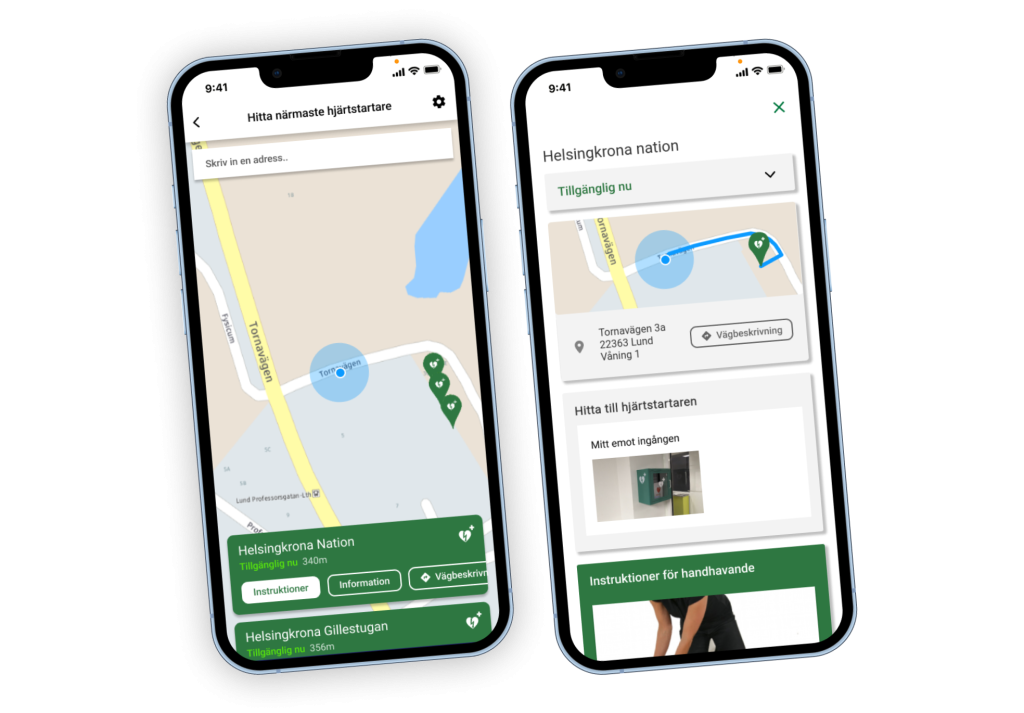
People bring expectations to how digital products should work. I structured the interface to be as familiar as possible by using common UI patterns. The defibrillator locator functions much like a maps application, so why not continue to build upon that conceptual model? This renders an app with a format that users are already comfortable with.
Final thoughts
It is always a neccessity in the design and planning process of an application to consider the end user and their conceptual image of the app. If everyone where to take this as seriousely as Don Norman does, then maybe we wouldn’t have such critical mismatches between user behaviour and what the developer intended.
If you’d like to discuss UI/UX strategies, I’m keen to connect through my web agency Kolifink!